
Adapted by:
Javier Pastor
Senior WriterComputer scientist turned tech journalist. I've written about almost everything related to technology, but I specialize in hardware, operating systems and cryptocurrencies. I like writing about tech so much that I do it both for Xataka and Incognitosis, my personal blog.

Adrián Álvarez
ContributorAdrián Álvarez began writing online in 2004 and has since shared his expertise across various media outlets. He now balances his role as an editor at Cinco79, which he co-founded, with his work at the digital magazine Canino.
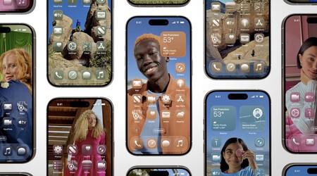
On Monday, Apple announced major changes to the interfaces of its operating systems, featuring a new design language called Liquid Glass. Notably, this design incorporates translucent elements throughout the user interface.
Alan Dye, Apple’s VP of human interface design, introduced Liquid Glass, which he described as being “inspired by the physicality and richness of visionOS.” The Liquid Glass design creates the appearance of a layer of glass applied to dropdown menus, buttons, and several other visual elements.
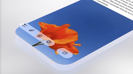
One distinctive aspect of these visual elements is their translucency, which acts like a lens. This allows users to see what’s underneath as if those elements were made of actual glass.
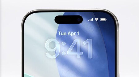
The realistic transparency mimics the effects of glass. For instance, on the iPhone wallpaper, the time digits slightly reveal the background color, modified by the Liquid Glass effect itself.
The new interface adapts seamlessly to dark mode if needed, although Apple mainly showcased light mode during the WWDC 2025 keynote.
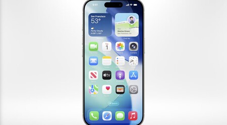
This interface promises to be particularly clean. However, at first glance, it doesn’t appear to be overly radical. The desktop looks more polished and has a more open feel compared to its predecessor. There are also additional effects.
For example, in iOS, the size of the clock display adjusts according to the wallpaper. As a result, the numbers become shorter or longer, depending on the height available for display. This ensures they don’t obscure other elements in the background, such as faces or objects in a landscape.
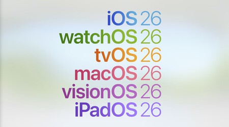
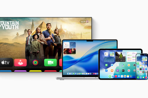
An important aspect to note is that these visual elements are universal across the entire Apple ecosystem. Apple is integrating the Liquid Glass design into iOS, macOS, iPadOS, tvOS, visionOS, and watchOS. All these platforms are set to take a significant step forward, with the expected release names changing from macOS 16 and iOS 19 to macOS 26 and iOS 26.
Additionally, some changes affect specific apps. For instance, in the Camera app, the company has streamlined the layout of buttons and options, reducing in number. Others are now hidden to achieve a cleaner default interface. In Safari, web pages are displayed side by side, and the tab bar now “floats” above the content.
It’ll be interesting to see how Apple users respond to this new design language, although it’s not a particularly radical departure from the company’s existing design principles.
Images | Apple
Related | The Decline of the ‘Apple Culture’: How Blind Devotion Turned Into Critical Enthusiasm